Global Shift in Climactic Regime
A tale of free airline wifi, a burning question about our changing climate, and (eventually) a reasoned approach to answering it.
A condition I agreed to when I moved away from my home state 5 years ago, was that I'd need to regularly take a cross-country flight to visit family and close friends. This happened several times this summer, and one one of these trips, I decided to dig a rabbithole in the realm of modeling and climate change. My personal mission has shifted over time towards designing systems and solutions that are sustainable, but something I've struggled to define is what specific skills and practices help me achieve success. An important aspect of designing sustainability is estimating and predicting impacts over time - something that a model can potentially predict for you. I try to regularly model the outcomes of my work, and in exchange, get better at making models.
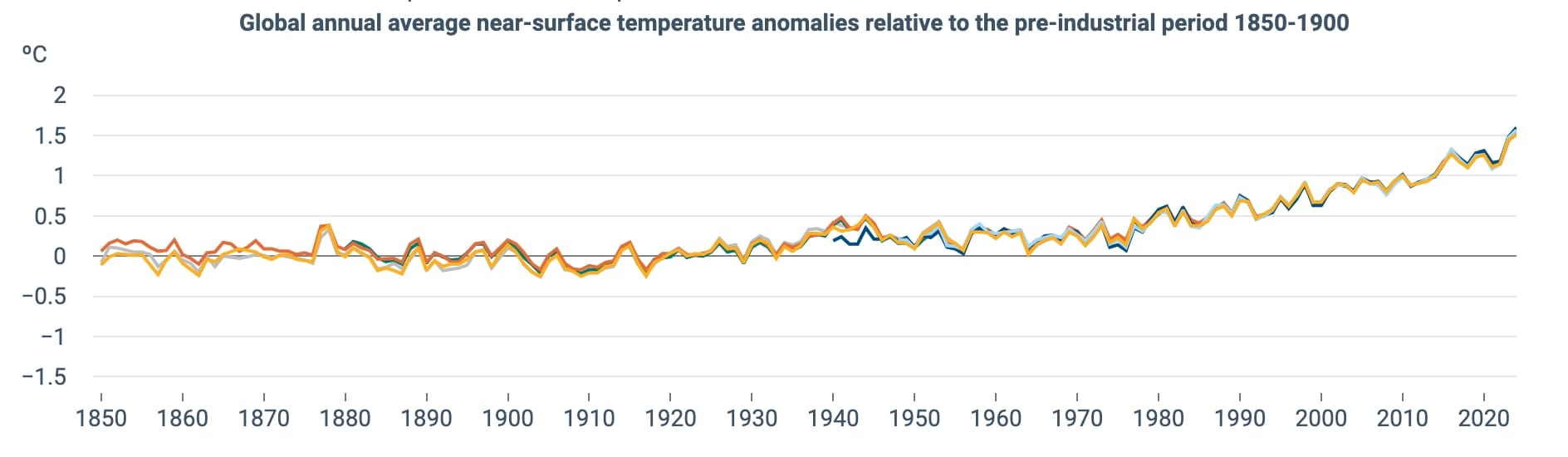
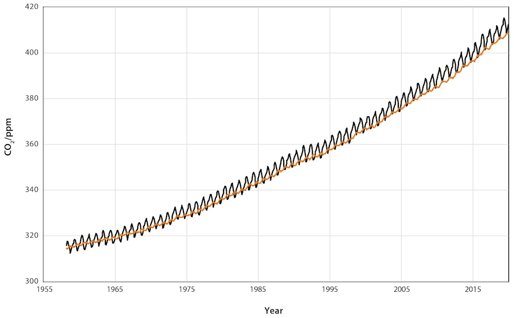
I'd been dwelling on a widely-seen phenomenon at the start of this trip - the Hockey Stick . Spread in the news in the late 1990s, it was a clearcut piece of data visualization showing that we'd done something quite significant and immediate to our planet's climate. This isn't a rabbit hole on the subject of whether or not we can reverse this change - for now, I only ask: why does the graph look like a hockeystick?
Evidence of this behavior is visible, plus or minus, in basically any chart of global averge temperature per year[1][2]. The obvious answer to "what" is “human activities, duh!”. But why is the change so abrupt starting around 1970, when humans have been constantly adding CO2 to the atmosphere over this time? [3]
“Doing my own research” sends me into clouds of uncertainty
I first, rather timely, considered the rise in airline travel to be this abrupt change. I hypothesized that airline travel growth has had an outsized impact on climate change and global average temperature, based on a few assertions:
- Aircraft use a lot of energy - it takes several MegaJoules to move one passenger’s share of an aircraft one kilometer (for a visual, 1 MegaJoule will lift six people in an elevator about 330', or 30 stories). Multiply this out and the energy used to fly a Boeing 757 100 miles is equivalent to someone solo driving over 8,500 miles!
- Of course there’s a false equivalency here - the above plane carries 200 or so passengers. The energy consumed per passenger is actually about the same as one person driving a Chevrolet Volt [source]
- Aircraft put most of their emissions tens of thousands of feet in the air. I have a hunch that heat is trapped differently way up there than it would be at ground level.
- Aircraft crisscross the globe more than any other form of carbon pollution. This feels like it should cause massive impacts globally, while ground based emissions seem more likely to cause local warming around developed areas.
- My understanding of airline history is also pretty limited, but I’m pretty sure we (America at least) started plane vacationing, flying for business, and generally marketing air travel as “fun for the whole family” a lot more around the 1960s and 70s.
- Airplane! came out in 1980. That’s enough evidence for me!
I wondered if I could see a correlation with the number of passenger miles traveled and temperature rise, versus something that might be a more clear-cut contributor like ground vehicle miles traveled (also a large emitter of CO₂). I collected data of airline miles traveled from a somewhat questionable source, a blog from the American Business History Center, a non-profit focused on education and information related to the history of commerce in the US [4]. This dataset was not published in a clear table format, and The Car VMT data was pulled from the US department of transportation [5] and the Federal Highway Administration [6].
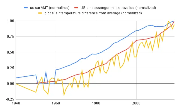
What I identified was initially affirming - there did seem to be a tighter correlation with airline miles traveled and temperature rise. Better yet - the rise lagged behind flight demand, something I would expect to see if the greenhouse effects of gasses emitted from planes flying take time to spread out and diffuse. To confirm this, I calculated how closely aligned ("Correlated") a scaled ("normalized") graph of air temperature was to the airline data, as well as US Car miles as a point of comparison.
| US air passenger miles traveled (millions) | US air passenger miles traveled (normalized) | US car VMT (trillions of miles) | US car VMT (normalized) |
|---|---|---|---|
| 0.95 | 0.95 | 0.93 | 0.89 |
Well look, air travel lines up more ! Am I uncovering something that isn’t talked about enough, or is this a correlation without any causation? Talking myself down a little, I acknowledged two things:
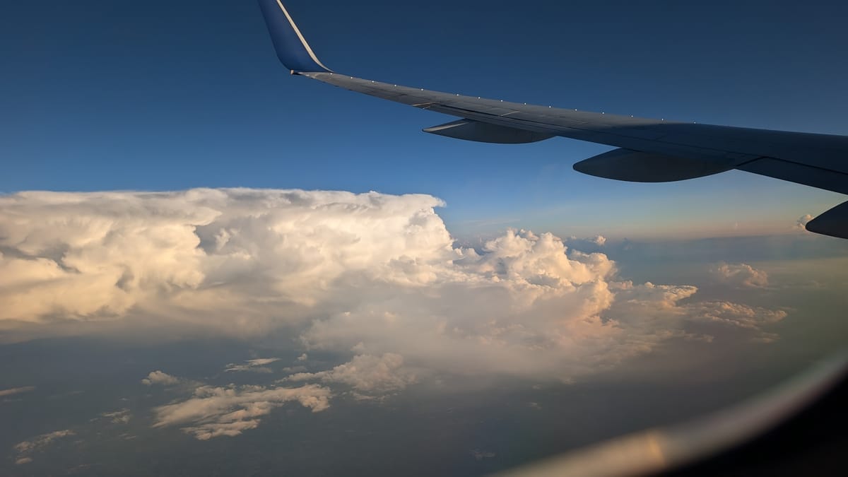
- People do talk about airline travel a lot. In fact, flying less is one of the biggest changes you as an individual can make to reduce human-caused climate change (following not driving and not having a child) [source]. There’s a reason I’ve been fixating on the impacts of flying for the past...(looks out window at midwest farm patchwork) huh, that went quickly. Time flies!
- There is certainly existing research on airline travel’s carbon emissions. What does it say?
Following that second note, I dug a few inches into a web search and found that I'm not that far off base, but also not onto something groundbreaking:
- Airline travel demand has exploded and has far outpaced technological improvements in the efficiency of aviation. Explained another way: planes are about twice as efficient today as they were 35 years ago, but demand has grown four times, so emissions today are still double what they were in 1990.
- And based on my other source, demand also quadrupled between 1967 and 1990…and between 1955 and 1967…and doubled between 1950 and 1955. Tech certainly did not keep up with that level of explosive change[1]
- Despite all of this growth, only 10% of the world’s population currently flies once a year or more. About half of us drive cars daily (certainly more than once per year), and almost all of us need to use fuel to grow food/cook/heat/cool the places where we live.
- The carbon footprint per flyer is large - but flyers per capita is still small.
- Accesibility to flying grows in demand when incomes increase. If the ideal is global upward social mobility, then we can't expect this number to plateau at its current level. All the more reason to keep looking into this!
- Gas emissions in the upper atmosphere do have an outsized effect on trapping heat, but it’s due significantly to water vapor, not just CO2. Clouds absorb reflected sunlight, and jet contrails are artificial clouds.
- Airlines contribute about 2.5% of our CO2 emissions, but 4-5% of our warming. Still a small amount compared to ground travel and ag/industrial emissions, however.
This helped me find peace with my confusion - the correlation I see is there, since air travel has shaped the curve of temperature rise more than some other forms of emissions. But because it’s not something most of us do every day, air travel is still a small slice of the emissions pie[2], dwarfed by larger impacts like heating our buildings, moving goods by boats, and... making tasty cows. while growth of flights did happen around this shift, its known effects weren't big enough to kick-start the current warming trend.
But it didn’t answer all questions for me, because there is a temperature upswing in the 1970s. And it occurs then, despite us driving cars, burning coal in furnaces, forges and firepits, and turning grasslands into synthetically-fertilized corn for our steaks and double doubles for many decades, even centuries prior. Why is that?
My materials scientist partner would like me to note here that turbine blades in aircraft engines deserve a little more credit here; these parts have seen significant improvement in not only material processing, but also barrier coatings, film cooling tech, etc., enabling plane engines to run hotter by many hundreds of degrees, and therefore more fuel efficiently. ↩︎
Serving emissions pie does not go over well at family gatherings. ↩︎
Worldwide Wobble in Weather Works
A paper by two civil engineers in India was an unexpected nucleus for my understanding to take shape from. Introducing the phenomenon as “global shift in climatic regime”, they identify that many patterns can shift abruptly, despite being precipitated by gradual changes. The concept does make sense to me - one analogy to electronics (my neck of the woods) is the Astable Multivibrator, a relatively simple circuit which abruptly switches between two states due to voltages which change slowly over time. You can see a virtual example of one working here. Another example from organic chemistry is the Briggs–Rauscher reaction, where small, gradual changes in concentration cause a rapid color change of a few choice compounds.
I won’t write much more on the meat of their paper (feel free to read my rough draft to see my notes), but they address something which has been very apparent in current events: this global shift has massively increased the max amount of rain or snowfall which can occur in a given area. The Earth, previously a relatively acne-free face, has suddenly broken out with pimples of potential downpours. No shock that humanity didn’t react to this change by immediately rebuilding all homes and infrastructure built prior to the 1970s, so the “unprecedented” flash flooding we’ve experienced lately is maybe an expected phenomenon, given what we have seen happen to our climate.
What papers written by non-engineers say on this subject I can barely begin to explain, but I'm able to pull out a few fuzzy points:
- Weather patterns have a huge sway on our atmosphere - as we noted earlier when we were unfairly (ok, somewhat fairly) blaming planes for climate change, water vapor is a strong greenhouse gas, as are clouds. That means that water vapor concentrations in the atmosphere could also correlate with rising temperatures. Unlike the unrealisitic possiblity of all humans flying to tropical islands for some R&R, 100% of water evaporates.
- Many datasets show that weather patterns had a noticeable shift in the 1970s. Those changing patterns are also changing what types of weather form. This has an effect on how much water vapor is in the atmosphere.
- Increases in water vapor amplify the effect of other greenhouse gasses. And more simply, a warmer atmosphere can hold a lot more water! This is because the saturation vapor pressure of water (the greatest amount of water vapor that can stay mixed with other air molecules) increases exponentially (aka annoyingly fast) with temperature.
So when you have a change in weather patterns, triggered by reaching a critical mass of carbon dioxide or other greenhouse gasses, not only is the amount of water vapor in the atmosphere shifted abruptly, the rate of warming and the capacity of air to hold greenhouse gasses both shoot up.
Ok, this makes sense. But for me in this window seat, it's is still a hypothesis. I’m not a scientist so I won’t hold myself to rigorously proving it out - but for the sake of making myself (and yourself) confident in this, I’ll try to produce my own Hockeystick.
Dumb Climate Modeling
I want to scratch up a basic climate model that shows this abrupt change happening, but this is a thought experiment so I don’t want to invest tons of time or use hard-to-comprehend existing climate models. I decided to make some significant simplifications:
- This model is of variables over time, and not space - let’s keep this simple
the numbers are totally made up and do not matter

- Despite this, no tweaking the numbers to satisfty my confirmation bias - if it’s not showing what you expect, leave that for an exercise in the future.
I created a stupid simple climate model set up around a few basic concepts, largely pulled from intuition and basic physics:
The amount of water vapor in the atmosphere is a factor of temperature and weather pattern “health”. If temperature goes up, water vapor goes up. if cloud formation goes down, water vapor goes up (clouds cause precipitation, so if there are fewer clouds, I’d assume there is more free water vapor? this is may be a bit hand-wavey).
Temperature is an energy sum equation, with existing thermal energy and:
- The product of sunlight (constant) and an absorbtion coefficient. As the coefficient goes up, more sunlight is absorbed.
- The negative product of temperature and a radiation coefficient. as temperature goes up, more heat energy wafts off the Earth.
This “absorbtion coefficient” is the sum of both the amount of water vapor in the atmosphere, and the amount of other greenhouse gasses.
Weather pattern health is based on whether or not global temperatures are above some threshold - if we exceed that threshold, they reduce somewhat.
- This amount of change isn’t clear to me, but I will take climate scientists’ word that it happens for now.
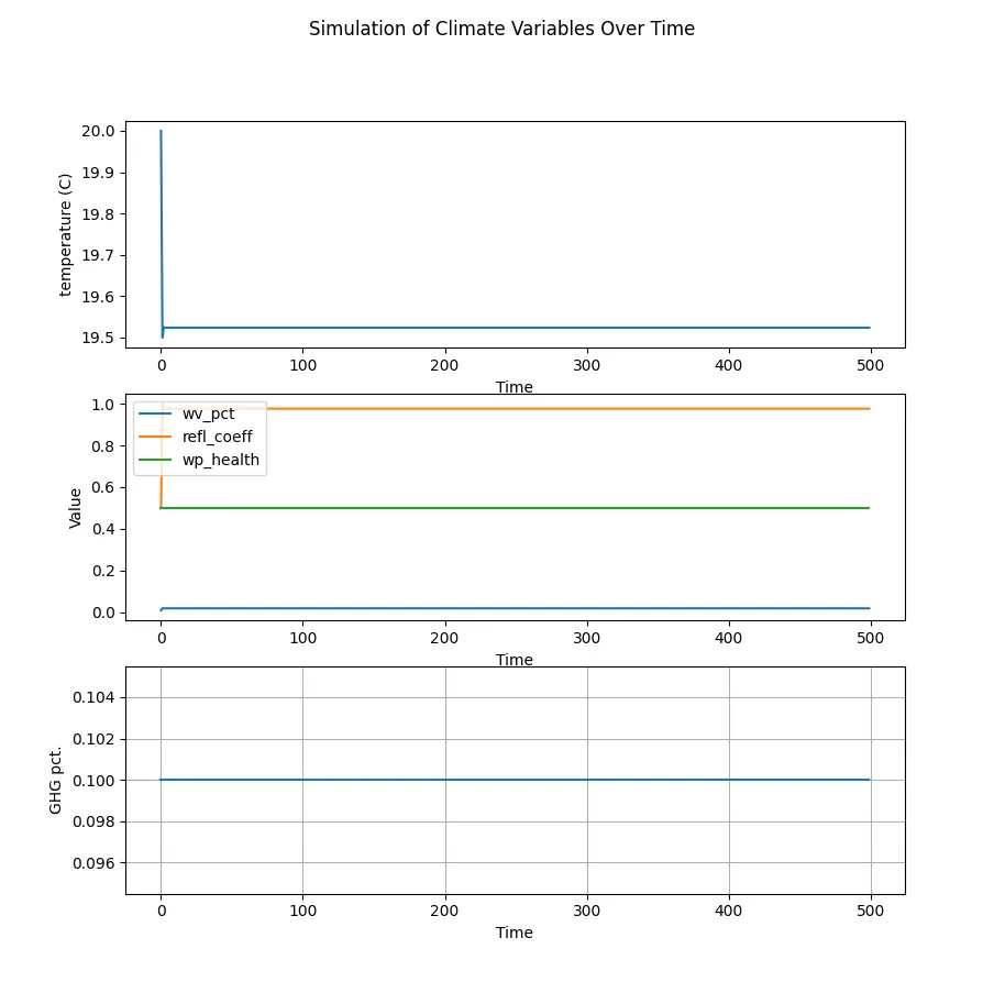
  #Don't think too much about the values of A,B,E_sunlight,K, and J
  weather_health = 0.5 if Temp < 21 else 0.3
  wv_pct = K * (Temp * A - weather_health * B)
  temperature = Temp + E_sunlight * absorb_coeff - Temp*rad_coeff
  absorb_coeff = J * (wv_pct + ghg_pct)
With this simplified and mostly unitless model, I am mostly focusing on relationships. I set the initial conditions for all of these constants so that the temperature does not change significantly over time, which is what we see in historic records (relatively recently, more or less). To do this, the amount of energy absorbed and the amount of energy radiated need to be about equal. Since my model is dummy simple, the behavior is also dummy simple.
It was surprisingly easy to reproduce a hockeystick-like change using this model - all I needed to add was a slight linear increase in greenhouse gasses. Initially I chose GHG to be 0.1% of the atmosphere, and to increase it by 25% over the span of my simulation (it ended at 0.125%). In the real world, CO2 was historically about 0.025% and is now approx. 0.04%, so it has increased by about 40-60% in the last 200 years. The result? at some point, warming kicks into high gear.
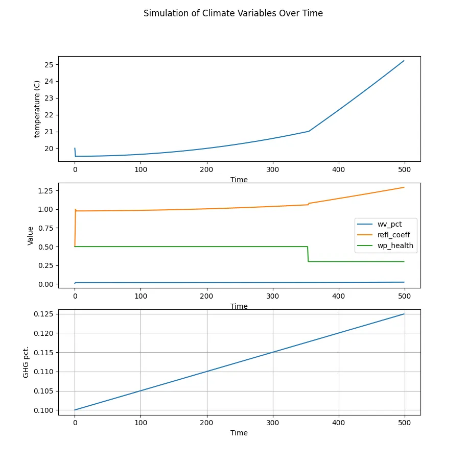
A few things I notice in this model:
- the weather health “shift” shows a relatively small change in reflection - the biggest impact must be how much water vapor is in the atmosphere.
- the change in water vapor is so slight, you can’t even see it in comparison to the amount of absorbed energy.
I wanted to try a few follow-ups:
- what happens if we use “realistic” GHG changes?
- what happens if we “stop” increasing GHG at some point?
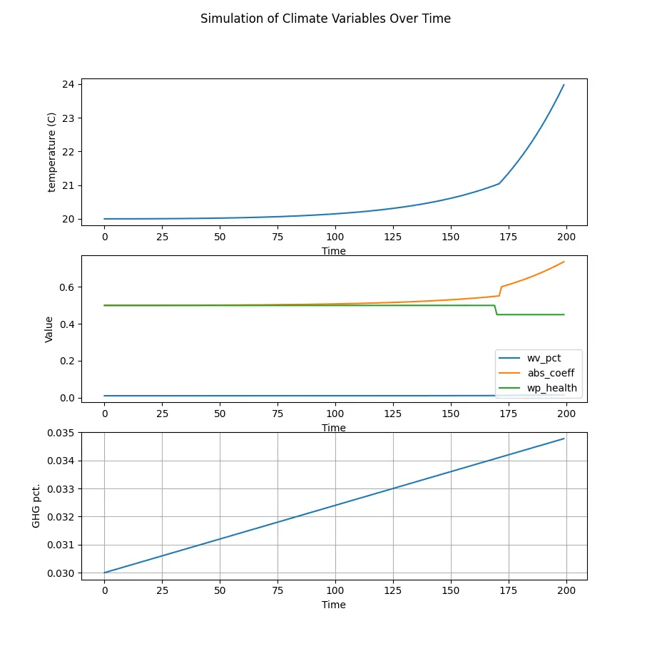
Realistic change
I used the numbers I mentioned above, then tweaked K until the simulation with constant CO2 returned to stable temperatures. I also reduced the influence of weather pattern change, since a 40% reduction in weather activity is pretty unrealistic. At first when I applied the greenhouse gas growth, I thought my model had broken - temperatures rose by many hundreds of degrees. however, I realized that my timespan was now too long. reducing the sim length revealed a curve disturbingly similar to what has been recorded historically:
Can we stop it?
What if we managed to stop CO2 emissions at some amountm or even decrease them? I added this logic to my simulation, and tried it again.
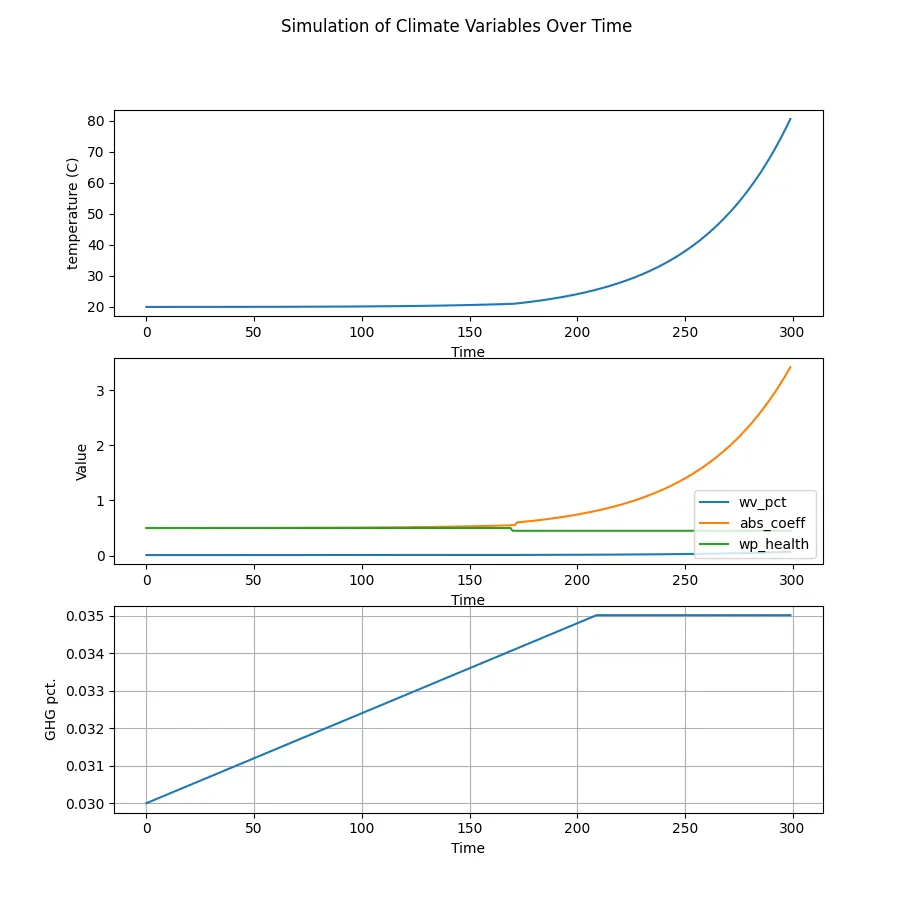
Uh, nope. I guess we’re doomed, at least according to this chart. This is the point where I check my expertise, and admit that these few lines of Python are a limited climate model. I’ll pass the baton back to the experts to determine what it will take to bend the curve (hint: it’s the economy, stupid)
Try it for yourself!
I took a bit of time to concoct a javascript implementation of the model using chart.js, it's embedded below. Both it, and the initial Python version I wrote, are on github.
So, does that make it irrelevant? Certainly not - the release of GHGs by humans has been so abrupt that the need of our ecosystems to adapt will be pushed to unprecedented levels. If our ecosystems die during this peiod, our climate might never recover.
Modest Conclusions
While I don’t trust this simplification to be anything but a hypothetical for some one-dimensional Earth, the ease at which a rapid change arises from slight changes in the variables at play is enough to help me reason with what I’m being shown by (rational) governments and climate-focused academia/media when it comes to the rapid jump in visible climate change. I’m also further encouraged to follow these stories and learn the methods we are actually using in research to predict future conditions. And I think it’s fair to also conclude that even if flying isn’t the biggest carbon contributor, no contribution is always better.